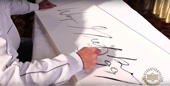
Upper Deck Authenticated’s line of “The Show” collectibles have been incredibly popular showcasing a HUGE signature from the best athletes in sports. The pieces are first signed by high-profile athletes like Wayne Gretzky and then mounted into a display where an acrylic plexiglass image of the athlete floats above the gigantic signature giving it a three-dimensional look.
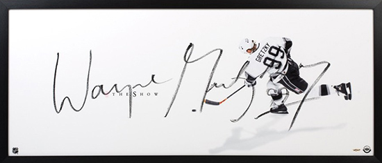
The finishing piece really needs to be seen in person to appreciate the beauty, but here is a look at one of Wayne Gretzky with the Los Angeles Kings.
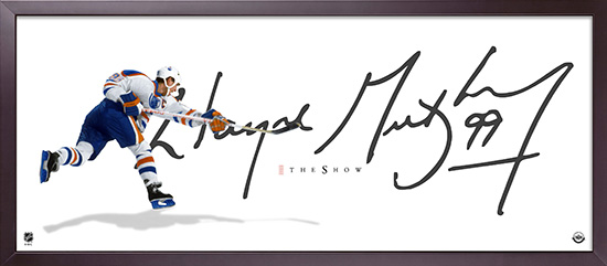
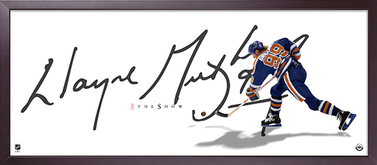
Now here is where we can use your help. We are down to two images to use for our new Edmonton Oilers “The Show” piece for Wayne Gretzky. Which image do you think looks the best; Image 1 or Image 2? Please sound off in the comment section below and look for the new piece this fall!








18 Comments
Image 1.
Def image 2, love the blue sweater with orange 99 that pops.
Image #1.Wayne is the best,always was and always will be.I have some of his Hockey cards,pins,patches and Books.Everything with the,Great Ones name on it ,I buy it.Don’t for get to send me a copy,to add to my Wayne Greztery collection.Thany-you so much.All the best from Newfoundland.You got my email address.Anything that don’t make the cut,send me a copy.I will send you my home address from the rock.Just email me.The Great-one- is-#1.
Image #1 looks the best
Oilers always look better in the all blue jerseys…Image 2! FYI…never put white on white.
Tough call. Image 1 is such a great image. Good leg extension, full power on the biscuit. Image 2 shows the iconic 99 in all it’s glory.
How about you send me one of each and I’ll decide which looks best after a few years on my wall?
Me and my son think image 1 because you can see his face.
Option 2
Image 1
I think image 2 best captures the Gretzky style. Both are sweet tho
I like Image #1, it is a nice shot of the Great One and it is opposite of the Kings piece so it would make a cool bookend edition for collectors.
Image 1 has the the iconic pose that I love – but the blue and orange shot in #2 is better, especially if he is in White with the Kings – it’s just a shame that the image covers “99” in the sig.
Hi. Although I like both images, I would go with Image 2. First off, the dark jersey stands out much better so it “pops” more. Secondly. although the pose is very similar to the Kings one I still like Image 2 more because it shows the iconic #99 on the back of his jersey that The Great One is so well known for.
So putting those two things together I think that Image 2 is the one to go with. Some people may not like that it blocks more of his signature in Image 2 but when viewed live with the 3-D effect, that is not really the case. Overall, Image 2 is just more vivid and has more eye-appeal IMHO.
Just my two cents worth!
I pick image 1.
Gotta Love the #2 Image!
Seeing the 99 is Awesome!
image #1
My vote is on Image 1. I like the subtlety of the old home jersey and the slapshot is captured at an ideal moment. A preference however would be to put the signature on top of the image like the LA Kings version.
Fantastic design. Loving the simple clean look.
For me image no 1 is almost perfect but should be there Wayne in “blue orange” jersey from picture no 2 😉